
At its simplest, the rebrand is about confidence. Confidence for you as a saver or borrower. Confidence that we will be here for the long term. And confidence that, while the world around us keeps changing, our values remain steady.
Goodbye uncertainty. Hello confidence.
A fresh look – and the same Society at heart
You may have noticed that things look a little different lately. Our logo, colours, website, and branches have all had a refresh. This wasn’t change for the sake of it – it was about making sure the way we look, and sound today truly reflects who we are, and how we serve our members.
At its simplest, the rebrand is about confidence. Confidence for you as a saver or borrower. Confidence that we will be here for the long term. And confidence that, while the world around us keeps changing, our values remain steady.
The decision to rebrand…
A note from Tracie, Chief Executive
“When we began talking about refreshing our brand, my starting point was simple: this has to feel like us.
We’re proud of our history and our mutual roots, and that will never change. But we also know that the world our members live in today is different to even a few years ago. This refresh is about making sure we show up with clarity, confidence and warmth – while staying true to the values that have always guided us.
I hope the new look makes it easier to understand who we are and what we stand for, and that it feels reassuringly familiar as well as forward‑looking.”
If you’d like to read the full Q&A with Tracie, click here.
Why did we decide to rebrand?
Over the last few years, a lot has changed. The way people manage money has evolved, expectations of digital services are higher, and life feels faster and more complex than it once did. As a Society, we’ve grown and modernised too.
What hadn’t quite kept pace was how we looked and explained ourselves.
Our previous branding had served us well, but it didn’t fully reflect the modern, forward‑looking building society we are today. We wanted a look and feel that feels:
- Clearer and easier to understand.
- Warmer and more human.
- Confident without being flashy.
All while still feeling familiar and reassuring to our members.
What has changed (and what you’ll notice)
On the surface, you’ll see some obvious updates:
- A new logo and colours.
- Clearer, more welcoming photography.
- A redesigned website that’s easier to use.
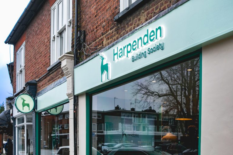
- Refreshed branches, starting with our new Harpenden branch.
But underneath that, we also spent time agreeing what really matters to us as a Society – and how that should come through in every interaction you have with us.
What hasn’t changed?
It’s important to say this clearly: the fundamentals of your building society have not changed at all.
We are still a mutual, owned by our members. We still put people before profit. We still make decisions for the long term, not short‑term gain. And we are still rooted in the communities we serve.
The rebrand wasn’t about changing who we are – it was about expressing it better.
What we stand for – in everyday terms
We boiled things down to a few simple ideas that guide how we work.
Built with purpose, not for profit.
Because we don’t have shareholders, we can focus on what’s right for our members and communities – now and in the future.
Straightforward by design.
Money matters can be complicated enough. Our job is to make things clear, transparent, and easy to navigate.
Empathy in every interaction.
Everyone’s situation is different. We take the time to listen and understand, rather than rushing to a one‑size‑fits‑all answer.
Reliability you can count on.
We do what we say we’ll do. People trust us because we’re consistent, dependable, and here for the long term.
A brand that feels human
We also talked a lot about personality. Not in a marketing sense, but in a very practical one: how it feels to deal with us.
We aim to be:
- Wise – We’re experienced, calm, and considered. We’ve been around a long time, so we’re confident in making the complex simple.
- Interested – We’re warm, human, and curious. We want to understand people and their lives, and just listen.
- Can‑do – We’re positive, practical, and direct. When people come to us with their challenges, we show we’re ready to help.
- Occasionally playful – We’re light-hearted, upbeat and fun. While money is serious, it doesn’t have to be dull.
That’s what we want you to experience whether you visit a branch, call us, or use our website.
Here’s our new look – a brand with hart
We’ve been around since March 3rd 1953, originally helping the local community and members, to afford homes.
Imagine that; we started in a year that celebrated the coronation of Queen Elizabeth II, the launch of the Royal Yacht Britannia and the first published James Bond novel Casino Royale!
We’ve got over 70 years of service and experience in helping our members and securing their financial futures. Our Society was built upon the vision of helping customers achieve their ambitions for the future, to serve our members and strive to help them secure their financial future so that their dreams and aspirations were made possible.
This founded the basis for thinking about what the new brand would be like and to help bring our ideas to life, and find something that embodied both the confidence, and the reimagined heritage of Harpenden Building Society. Whether you’re popping into a branch, going online or giving us a ring, you’ll find someone who is eager to lend you a hand and help.
Why the hart (stag)?
Our new emblem – the hart – is rooted in our local heritage. You’ll find it in Hertfordshire’s coat of arms, and references to it go back centuries. It’s a symbol of strength, wisdom, and confidence, as well as deep local roots.
For us, it neatly captures both sides of our Society: long‑standing experience, and a confident eye on the future.
A better digital experience
Alongside the fresh look, we’ve also launched a new website. The aim was simple: make it easier for members to find what they need and manage their finances online.
We looked carefully at what members told us they wanted, and focused on clearer navigation, improved functionality, and a more accessible design – all wrapped in our new visual style.
Take a look at our new website here.
Our branches and our communities
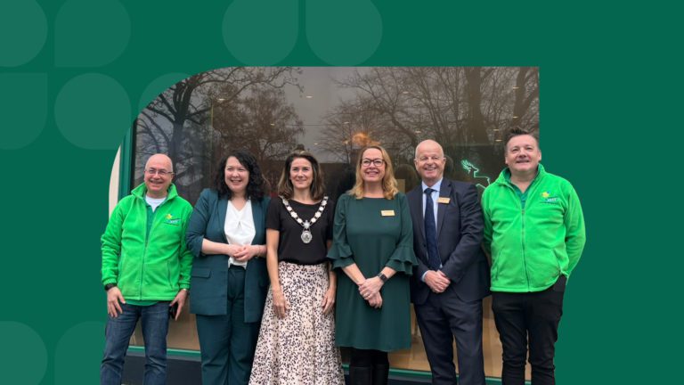
The refresh also gave us the opportunity to invest in our physical spaces. Our new Harpenden branch is a good example of what we’re aiming for: welcoming, comfortable, and designed around real conversations, not transactions.
Other branches will follow with updates, and throughout it all, our commitment to serving our local communities remains unchanged.
In short
This rebrand is about confidence, clarity, and continuity.
A clearer way of showing who we are. A more modern experience for our members. And the same trusted building society at heart – owned by you, and here for the long term.
We’re proud to share it with you, and we’re only just getting started.
Take a look at the full Issue 7 of Mutual here.
Related Mutual

APR 27, 2026
Jon’s Savings Blog – ISA Changes in 2027
Why 2026/27 might be your last chance for a £20,000 ISA Allowance…
APR 27, 2026
Shoulder Surfing
Criminals operate everywhere which is why it’s important to keep your phone and digital banking details safe. They might try to steal your mobile phone or ‘shoulder surf’ you.
APR 27, 2026
Rebrand Baking Competition
To celebrate our rebrand…for you bakers out there… here’s a chance to show off your skills in the kitchen!
APR 27, 2026
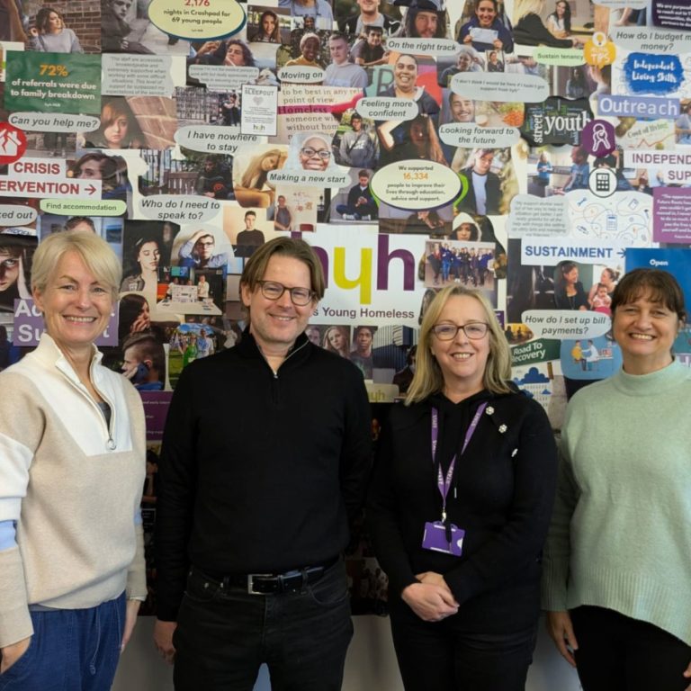
Herts Young Homeless
HYH is an independent charity founded in 1998 that supports vulnerable young people across Hertfordshire who are facing homelessness or the risk of becoming homeless.